

Here Plus App
On November 15th, 2017, Doppler Labs launched Here Plus – a new companion app for its Here One wireless smart earbuds. This app would mark our pivot into serving the Hard of Hearing community and disrupting the hearing health market.
Here’s how we did it.
Here’s how we did it.
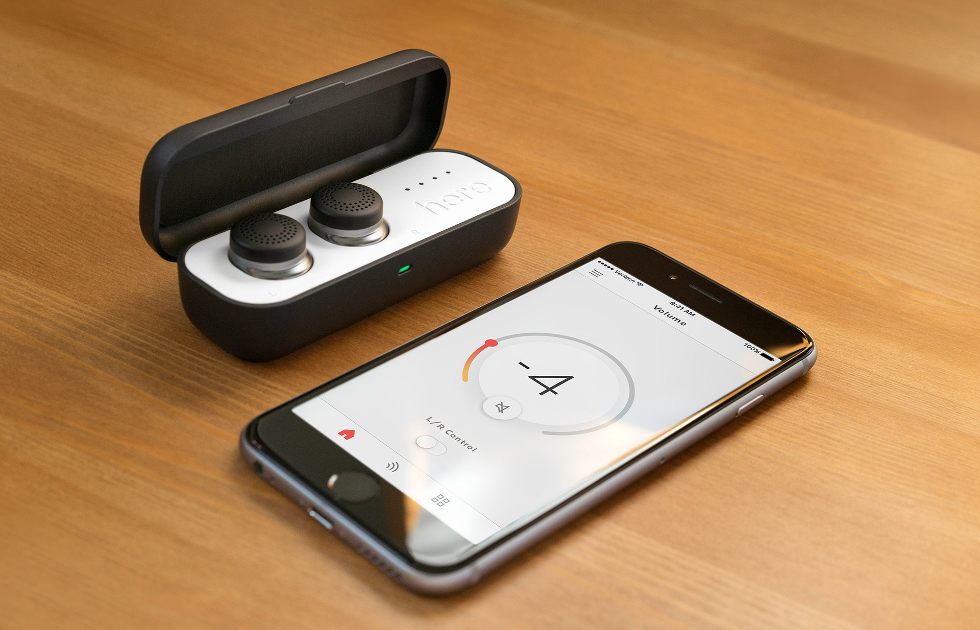
The Here One buds and Here Plus app that I worked on.
My Role
I was part of a 6-person team including a Creative Director, UX Researcher, 2 Product Managers, and an iOS Developer.
Because we were a small, agile team, we collaborated across all the core Here Plus features. I wireframed, prototyped, user tested, built UI components, and designed high-fidelity mocks.

Photo by Hardy Wilson. Retouching by Nikki Rotunda.
Background
In February 2017, we launched Here One, a pair of wireless smart earbuds.
With its 1st gen companion app, you could stream music, make phone calls, and control noise cancellation. Unlike most noise-cancelling headphones with an on/off noise cancellation toggle, our earbuds and app provided granular noise cancellation control. Users could turn down and even turn up outside noise. Additionally, our app's noise filters cancelled and reduced sounds of particular environments (ex. airplane, cafe, office, etc.).
These were the first of their kind.
Naturally, our early users were tech adopters and audiophiles interested in noise cancellation, a wireless form factor, and premium audio quality.
In the following months, however, we saw growing adoption from the Hard of Hearing community (HoH). In fact, HoH users grew to account for over 33% of our users. Many found our speech amplification capabilities life-changing. They frequently shared stories about being able to confidently attend social gatherings, listen to conversation, and fully engage with loved ones again. Others found Here One's noise cancellation perfect for alleviating discomforting noise due to misophonia, tinnitus, and other auditory processing disorders.
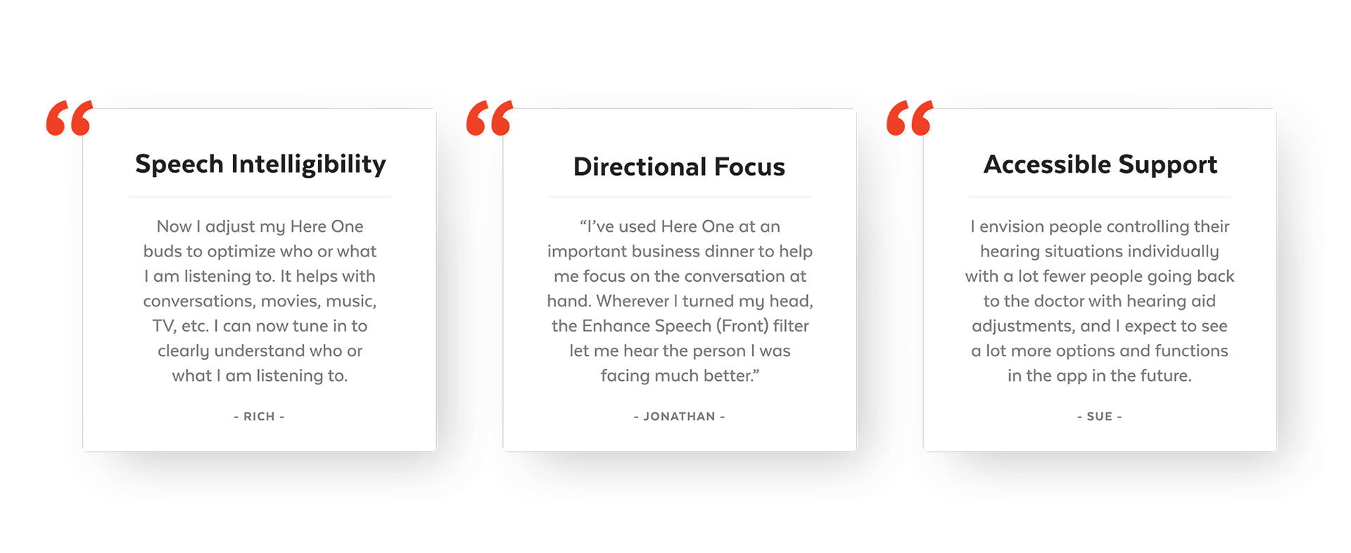
In short, they saw Here One as a hearing aid alternative.
Several Reasons:
Several Reasons:
Unstigmatized Form Factor
Users wore Here One proudly because it doesn't look like a traditional hearing aid. It can simply be an incognito wireless earbud. For demographics concerned with the social stigma of traditional hearing aids, Here One becomes an utilitarian tech gadget that friends can even use.
Powerful & Granular Control
Our companion app gives our users unprecedented real-time control. Meanwhile, traditional hearing aids require a visit to the audiologist for in-person tuning. This is not always effective because audiologists tune hearing aids in simulated sound environments which may not reflect a users' actual environment.
Competitively Affordable
Priced at $299.99, Here One provides enormous value. Traditional hearing aids cost between $1,000 - 4,000 each and is not typically covered by health insurance. Additionally, audiologist visits and maintenance costs add up.
The Opportunity
In Fall 2017, the Over-the-Counter Hearing Aid Act passed. The FDA was now required to create and regulate a new category of accessible, over-the-counter hearing aids.
With legislation progress and our growing HoH community, Doppler Labs saw an opportunity to fully pursue providing quality hearing health solutions to those who need them most.
Utilizing existing Here One hardware, we built a new 2nd gen app experience.
Utilizing existing Here One hardware, we built a new 2nd gen app experience.
This would become Here Plus.
The new Here Plus app's core features. Designed for the Hard of Hearing community.
Here Plus Goals
With the new target audience and business objectives, we set several goals:
1. Validate new hearing health features and opportunity in this new market.
2. Improve usability and discovery of core features based on user feedback from the 1st Here One app.
3. Share learnings to inform future gen hardware builds.
Usability Improvements
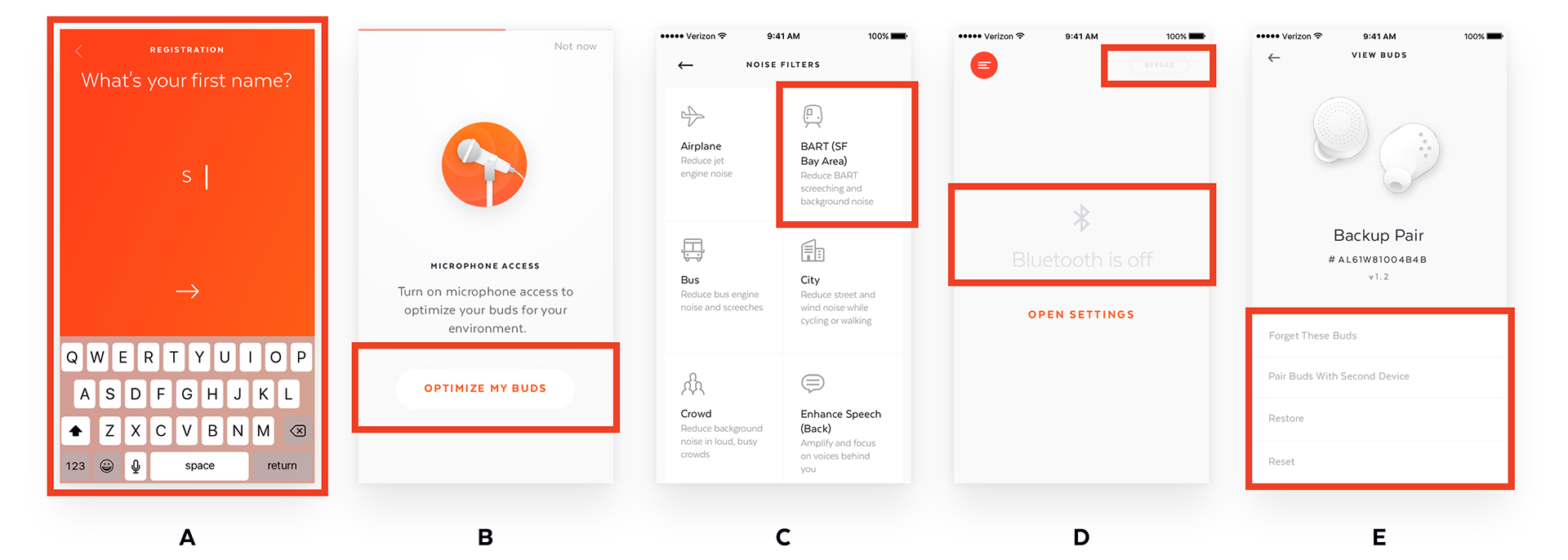
The launch of Here One gave the team insightful feedback on app pain points. Most frequently, users had difficulty navigating and discovering core features. We set out to redesign our information architecture and make our UI intuitive.
Note: I’ll first discuss the UI improvements to our core feature since this will make more sense when I introduce IA redesigns.
Note: I’ll first discuss the UI improvements to our core feature since this will make more sense when I introduce IA redesigns.
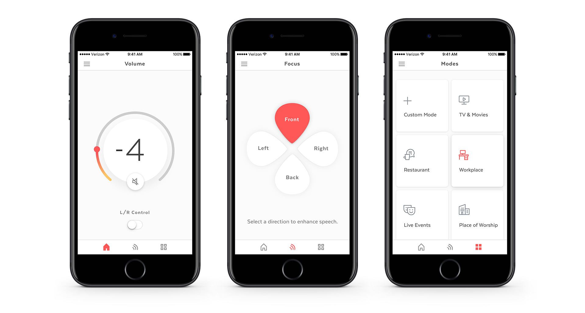
Discoverable Volume Controls
One of the core features and home screen was volume control. Here, the user could turn down or up the volume of the outside world (cancel noise or amplify sounds).
However, the 1st app's UI looked like the following.
One of the core features and home screen was volume control. Here, the user could turn down or up the volume of the outside world (cancel noise or amplify sounds).
However, the 1st app's UI looked like the following.
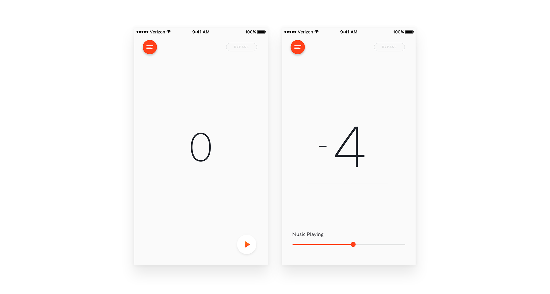
This floating number without clear affordances or labels confused users.
Looking at the screen, a user wouldn't know the interaction actually requires a swipe up or down from anywhere on the screen.
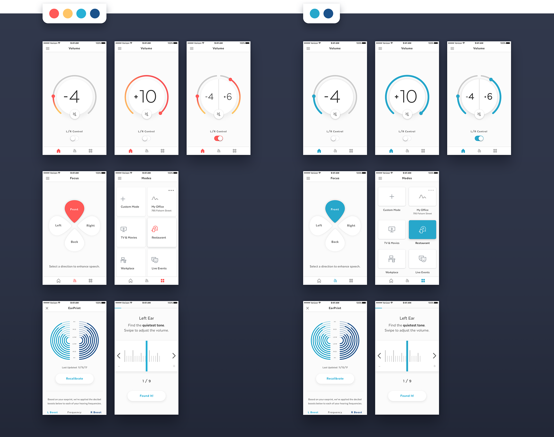
With our focus on HoH accessibility, we knew we could provide better clarity to this feature. We tested different horizontal and vertical sliders, both intuitive choices for volume control.
Looking at the screen, a user wouldn't know the interaction actually requires a swipe up or down from anywhere on the screen.
With our focus on HoH accessibility, we knew we could provide better clarity to this feature. We tested different horizontal and vertical sliders, both intuitive choices for volume control.

However, in our previous app, when music was playing, users could also control music streaming volume through a horizontal slider.
To distinguish the two UI, we leaned towards skeuomorphism by experimenting with a volume knob design to pair with the horizontal music streaming slider.
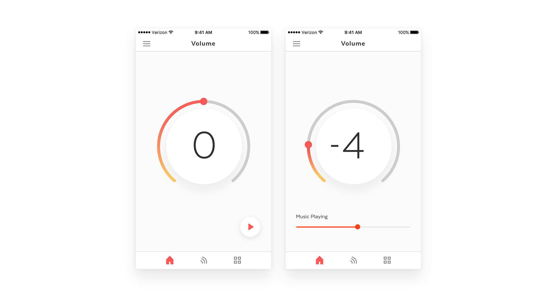
We received positive feedback from our early beta testers. They quickly interacted with the volume knob and were delighted by its visual feedback. Moving forward, we became confident our changes produced a clearer CTA and more intuitive experience.
Ongoing Improvement
HoH user testing feedback and business requirements evolved our designs.
HoH user testing feedback and business requirements evolved our designs.
1. We realized the music player had limited value due to its minimal in-app controls. We decided to shelve this feature for a future release.
2. Testing with HoH users also informed us of the importance of having quick access to mute loud, unbearable sounds (sirens, screeching, etc). To accommodate this feature request, we incorporated an easily accessible mute button to the volume knob. Tapping mute would bring the volume of the outside world all the way down to -10 and cancel out noise.
3. We also addressed users with asymmetrical hearing loss by introducing the ability to separately control left and right volume. On the home screen, we introduced a persistent toggle to promote discovery of this new control. Moving into beta testing, we planned to test frequency of use and engagement with this feature.
3. We also addressed users with asymmetrical hearing loss by introducing the ability to separately control left and right volume. On the home screen, we introduced a persistent toggle to promote discovery of this new control. Moving into beta testing, we planned to test frequency of use and engagement with this feature.

(Left) Quick access mute activated. (Right) Asymmetrical hearing loss volume controls.
Another usability improvement I worked on was to make certain features, such as noise filters, more visible to our users as they were tucked away behind a hamburger menu.

1st gen Here One app was shy about its core features.
My suggestion was to advocate the use of an intuitive, familiar tab bar. My reasoning was this would be optimal for discovery and inclusive of our new target audience (a less tech savvy, older demographic with possibly reduced visual abilities and motor skills).
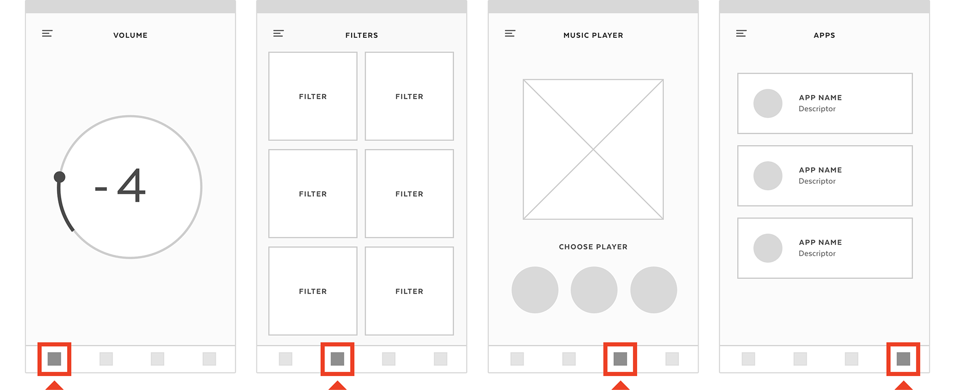
Tab nav. Let's keep it classy.
We tested to validate our hypotheses. We did quick gut checks around the office, asked friends and family, and tested with HoH users.
Testing the tab navigation, all users were able to naturally and more confidently discover our core features due to the familiar patterns. Doing so, we learned quickly and qualitatively about user needs and how they value app features versus repetitive feedback about IA struggles.
Testing the tab navigation, all users were able to naturally and more confidently discover our core features due to the familiar patterns. Doing so, we learned quickly and qualitatively about user needs and how they value app features versus repetitive feedback about IA struggles.
New Features
Modes & Focus
One prominent 1st gen feature, Filters, actually evolved into two new features. Originally, Here One Filters were focused primarily on noise reduction. However, due to our hearing health audience’s needs, our product and audio teams decided to redesign all the Filters to emphasize speech amplification and intelligibility.This change impacted our designs by splitting Filters into two separate utilities: Focus and Modes.
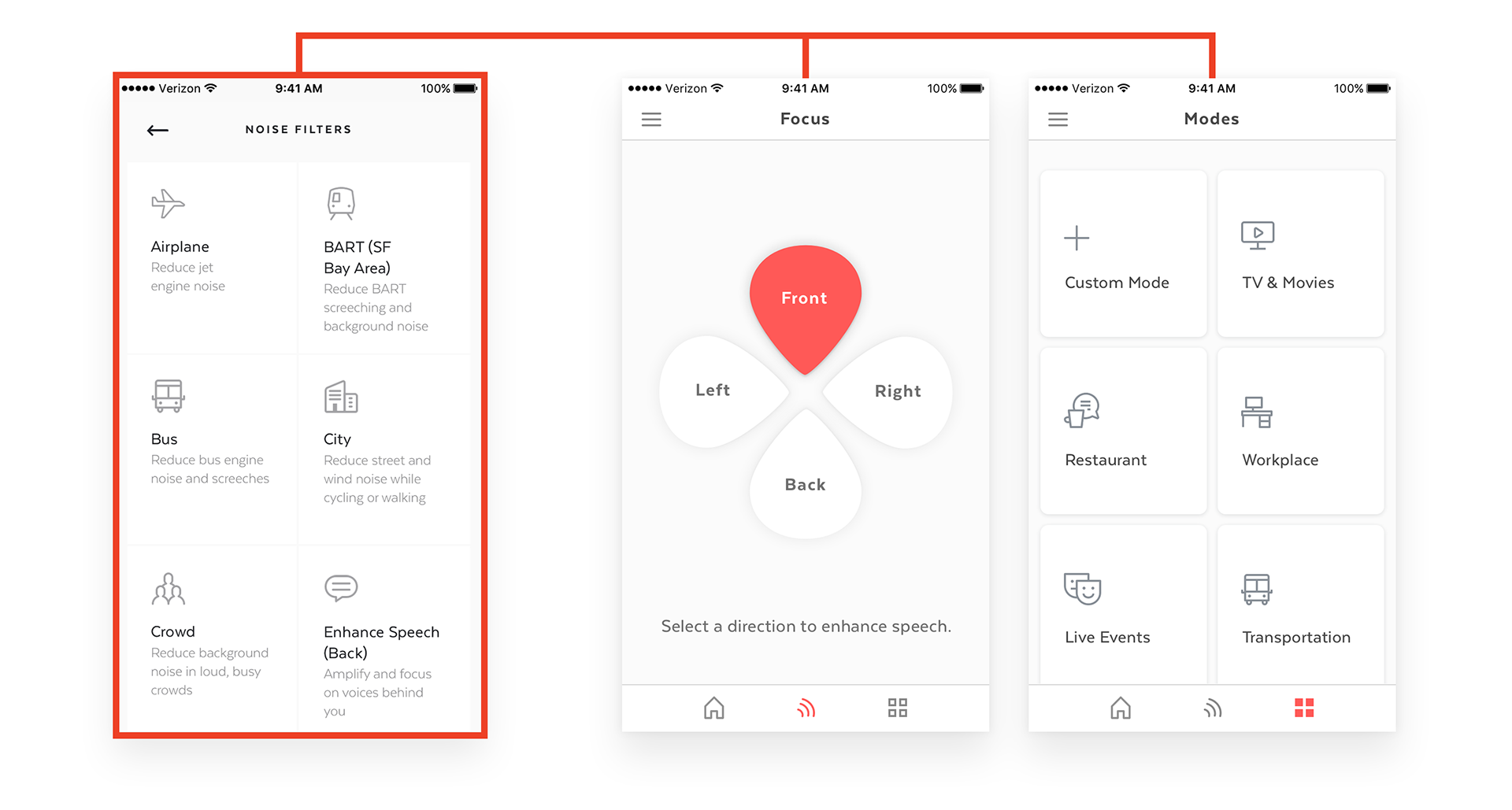
In Focus, users could amplify speech around them by selecting a direction (front, back, left, or right).
In Modes, users could select particular environmental modes. Behaviorally, this was similar to the original Filters, but users could now turn on the workplace filter to amplify a friends’ voice instead of reduce noise.
I worked with our PM to create the new Focus experience. We originally designed focus to require a directional selection and environmental mode (ex. enhance speech front + office). We also experimented with multi-directional selections (ex. enhance front + right + back). From our testing however, we found adding environmental and/or multi-directional modes produced minimally perceivable differences in sound quality. We wanted to keep the feature simple and validate among our users. In our final deliverable, we designed a simple directional UI which users could single-select.
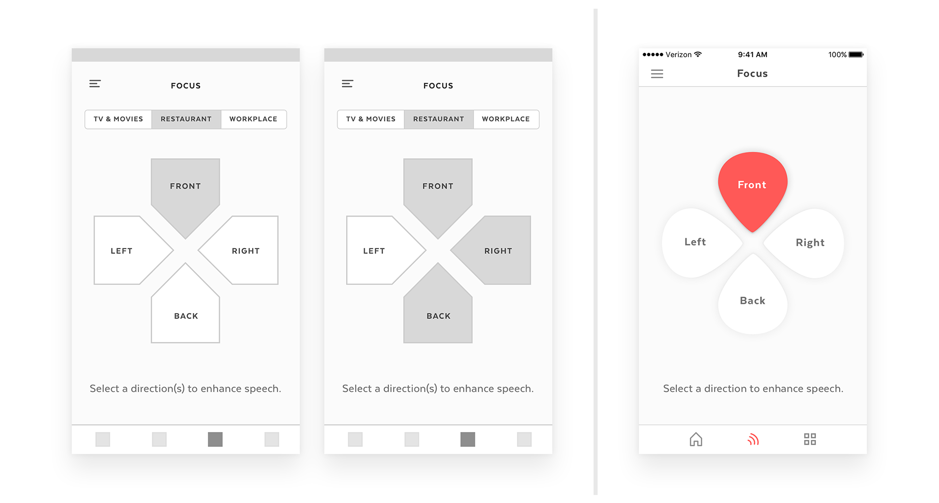
For the Modes experience, I designed new iconography and optimized the UI for ease of use. We wanted to reduce the decision-making process for our users. We removed the mode descriptors since all the modes were now redesigned for speech amplification and intelligibility. The language was repetitive and unnecessary.
From HoH beta testing, these new features were found intuitive and useful. Users were impressed by the audio quality and excited about using these premium controls which are typically found in expensive hearing aids. We also learned about common places where users experience difficulty hearing and built new environmental modes specifically for these places.
Branding & Consistency
Since Here Plus would be released as its own app, we had an opportunity to revisit our brand.
Before this greenlight, we had frequently debated the scalability of the Here One brand for accessibility. Originally, the Here One brand was built as a futuristic wireless smart earbud. Our audience was much different. They were the techy, hip, headphone-lover who primarily wanted to noise-cancel and jam out.
However, our new HoH audience (who still loved noise-cancellation and jam sessions) needed easy-to-use hearing controls that were both empowering and accommodating. We had to rethink how to address various levels of tech, motor, and visual proficiencies. While we accomplished many of these through usability and IA improvements, there were also numerous opportunities to produce a more inclusive brand through visual design.
Examples & Challenges
While using the 1st gen app, I encountered instances when our vibrant orange-red brand color caused anxiety and decision fatigue. Used in certain fields, notifications, and buttons, the orange-red evoked aggression, danger, and error.I also had frequent difficulties with readability due to low contrasting colors and font sizes. This proved to be common feedback from our users.
1st gen app examples. Not the good danger, but the bad danger.
In new features such as our volume dial, sliding the knob and seeing a vibrant orange-red gradient provided points of anxiety for our beta users (“I see this orange-red indicator. If it gets redder, does that mean volume is too high? Is this bad?”).

For other features such as the hearing assessment tool, we couldn’t even use an orange-red design due to the strong emotions evoked. Users were hesitant engaging with our slider. We began designing with a secondary blue color which felt more calming and inviting. This led to a Frankensteined experience as portions of our app were warm orange-red and others cool blue.
It was time to unify the brand.
It was time to unify the brand.
Solutions
I sought to optimize our designs for better accessibility and inclusion.
I increased font sizes for legibility. I made title and sentence casing adjustments to make headers and buttons feel more approachable. I also improved color contrast throughout the app.
I took these UI components to create an updated style guide and Sketch symbols to accelerate our team workflow and standardize app branding.

To address usability concerns with the aggressive orange-red and unify app branding, I experimented with calm, cool colors. I wanted to evoke a sense of trust and enablement. I explored a blue that felt approachable.
In the process, I found additional opportunities for UI optimizations. I increased the stroke of the volume knob and added more depth and contrast to buttons for clearer interaction. I also updated the Modes UI for consistency and clarity of actively selected modes.
In the process, I found additional opportunities for UI optimizations. I increased the stroke of the volume knob and added more depth and contrast to buttons for clearer interaction. I also updated the Modes UI for consistency and clarity of actively selected modes.
Below you can see my explorations for a cohesive, approachable experience. Due to our development timelines, these color and UI updates were slated for a future sprint.
Outcome
While preparing for beta testing in the first week of November, we heard the news. Due to fundraising challenges, Doppler Labs would be winding down.
We were completely shocked. Over the past months, we had fostered tremendous support from the HoH community and beta groups. Here Plus was coming together and our team began planning for the next gen hardware. We were so close.
Unfortunately, this reality was out of our control. What was in our control was providing a final send-off thank you to our users. The team worked diligently to to keep our promise to our supporters and launch the app. We removed the app paywall and shelved half-baked features. We completed the ones most valuable to our users.
After months of long nights and usability learnings, Doppler Labs launched Here Plus on November 15th, 2017 on the iOS App Store.
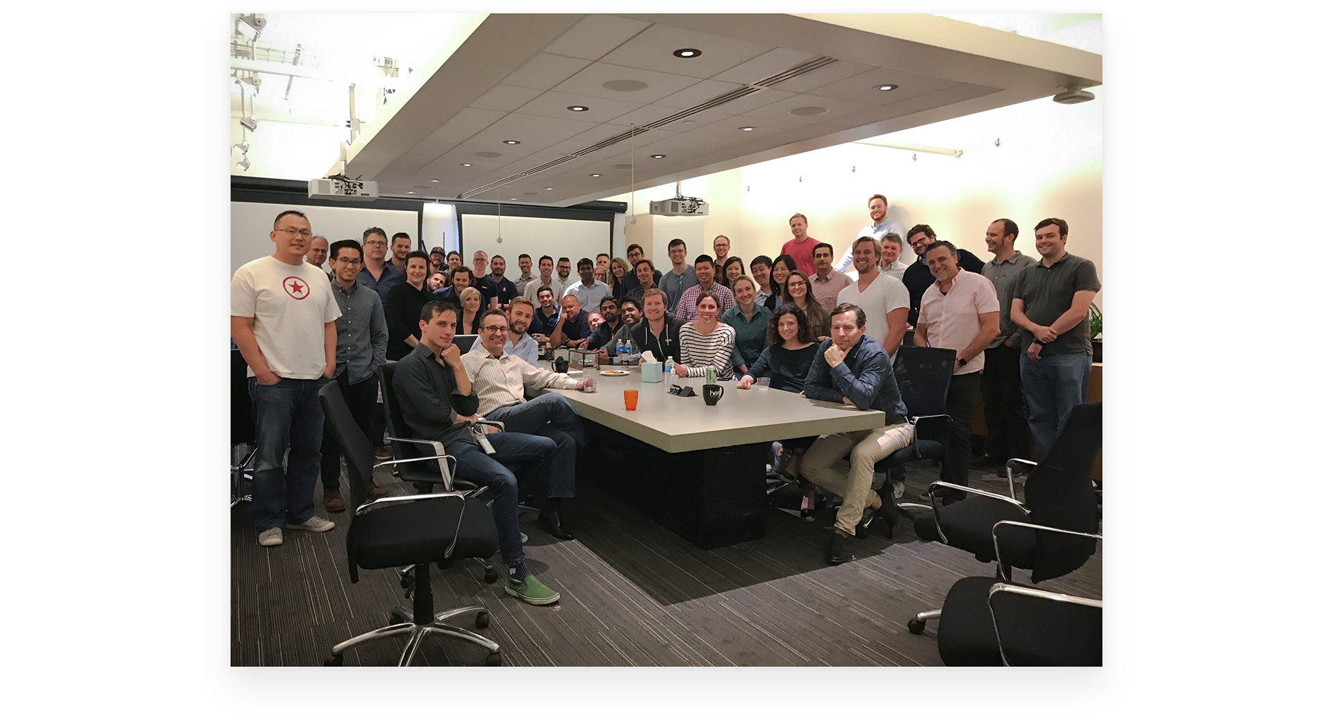
Doppler Labs team in August 2017.
Learnings
I’m proud to have been part of a team passionate about changing the future of hearing health. The six months working on this project challenged me to grow in ways I never thought before.
I learned to design for accessibility and inclusion. Intuitive and forgiving IA is important. Brand colors mean so much more for usability than just as marketing eye candy.
I saw the challenges of building, validating, and iterating hardware. It’s especially tough showing someone a digital prototype without functioning buds. It’s a lot of “Hey, imagine this sound!” and inferring qualitative feedback. Patience and empathy are key.
I realized how helpful constraints are, particularly when building a multi-functional futuristic experience. Once we defined our audience and fully committed to hearing health, we began designing more intelligently.
Regardless, always stay flexible and try things.
The Hearing Health market will be disrupted. And Doppler Labs helped pave the way.
Thanks for reading!
Brian
P.S. Check out the app.
Regardless, always stay flexible and try things.
The Hearing Health market will be disrupted. And Doppler Labs helped pave the way.
Thanks for reading!
Brian
P.S. Check out the app.